01
Building a design system anyone can use
We started on WordPress. We ended up building something AI agents can actually read.
Product School runs one of the largest product management communities in the world — courses, certifications, events. When I joined, the website ran on WordPress. It worked, mostly. But the design was fractured across a growing site, and the team was scaling faster than the foundation could support.
I led the design system work end-to-end: from the initial audit through to a component library used daily by designers, engineers, content editors, and PMs.
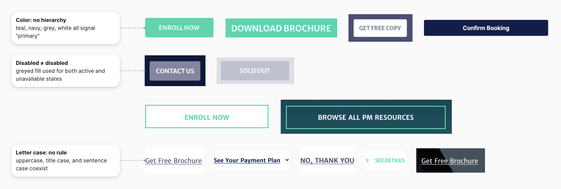
As the team grew and we added more courses, more pages, more everything — the cracks started showing. Buttons in three slightly different shades of blue. Layouts that made sense on one page and fell apart on another. Developers copy-pasting components they weren't sure were current.
We needed a design system. Not because it was the right career move, but because the alternative was slowly drowning.
The stack
We wanted the latest and sharpest — not because we were chasing trends, but because we knew we'd be building on top of this for years. Contentful, Tailwind, React, Next.js, Vercel. We were also deliberate about analytics from early on: component usage tracked, events defined in a way that could grow with us. Not a perfect system — but a scalable one.
What we built
We built on top of that in layers.
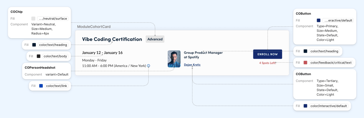
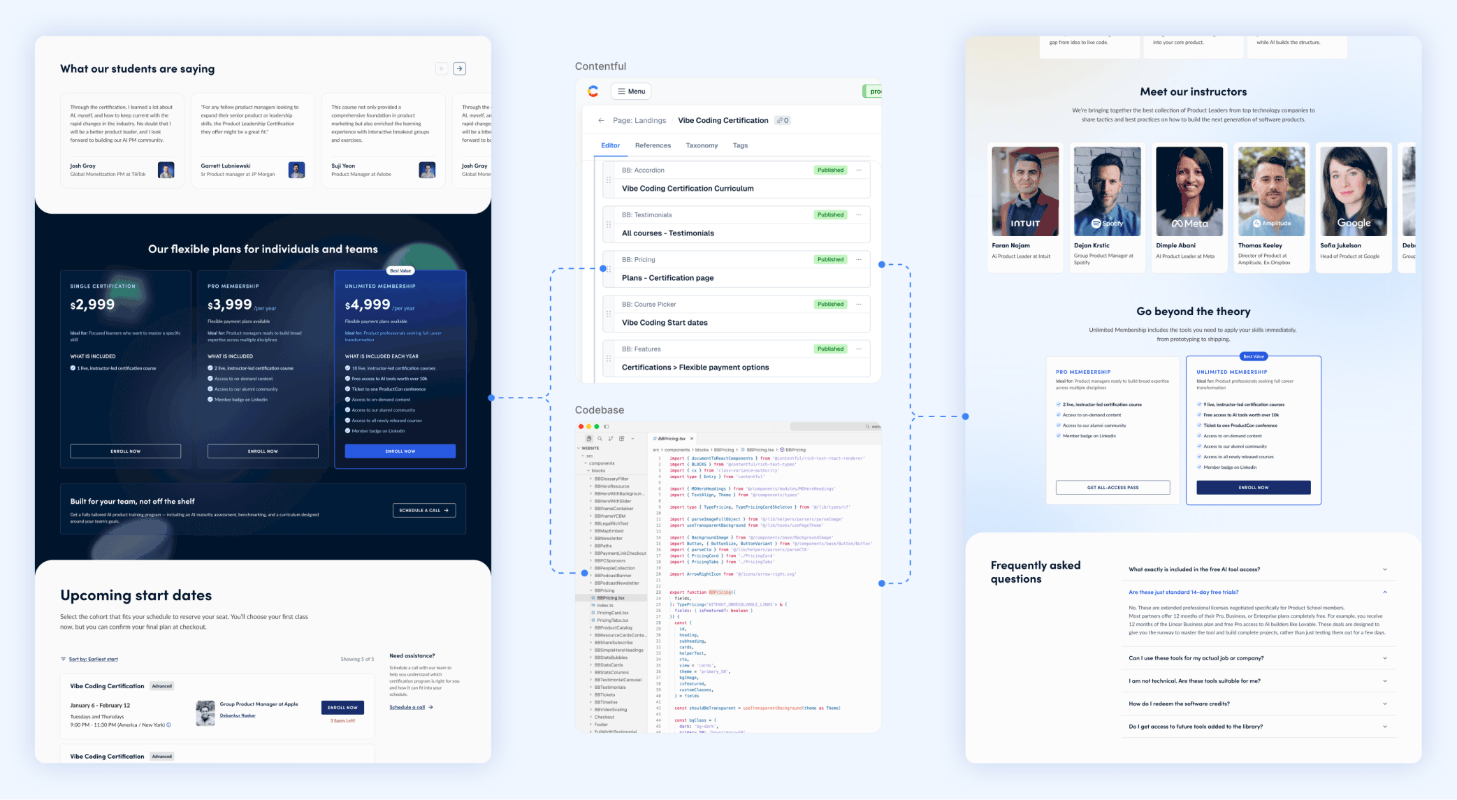
The Figma library connected directly to the codebase through Contentful. Tokens were the source of truth — not a file someone might forget to update, but a single definition everything pulled from.
We added a Storybook. It worked, then slowly stopped being used — not because it was broken, but because the team didn't need it the way we thought they would. We archived it. Some tools are right in theory and wrong for a specific team at a specific moment.
The accessibility layer was basic but intentional: contrast ratios, keyboard navigation, ARIA labels defined at the component level.
And the content guides — two of them, one for marketing, one for educational content. Different audiences, different rules. These lived in the system, not in a shared doc that drifts.
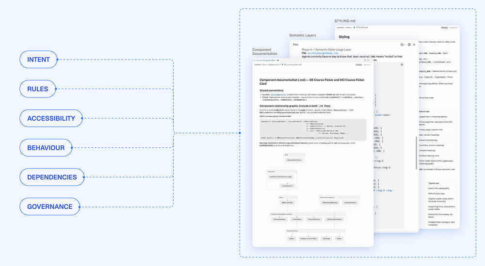
Making it AI-readable
This year the question shifted. Not "do we have all the components?" but something harder: can an AI agent actually use this?
If the context is noise, the output is noise. A button needs to know when to be a button — what it competes with, what it means in a card vs. an alert. That's not a design token. That's judgment, written down.
We started with naming conventions that were semantic from the start — not btn-blue-lg but names that carried intent and could be parsed by something with no visual intuition.
Then the .md files. A context document for every component and major section — written differently depending on where. The public marketing pages have different rules than the member education area: different tone, different assumptions about who's there and why. We wrote those distinctions down explicitly.
The last layer was the skills — structured prompts built for the product team. Someone onboarding shouldn't need three Slack threads to understand how we write a course card. They ask, they get a consistent answer that reflects how we actually work.
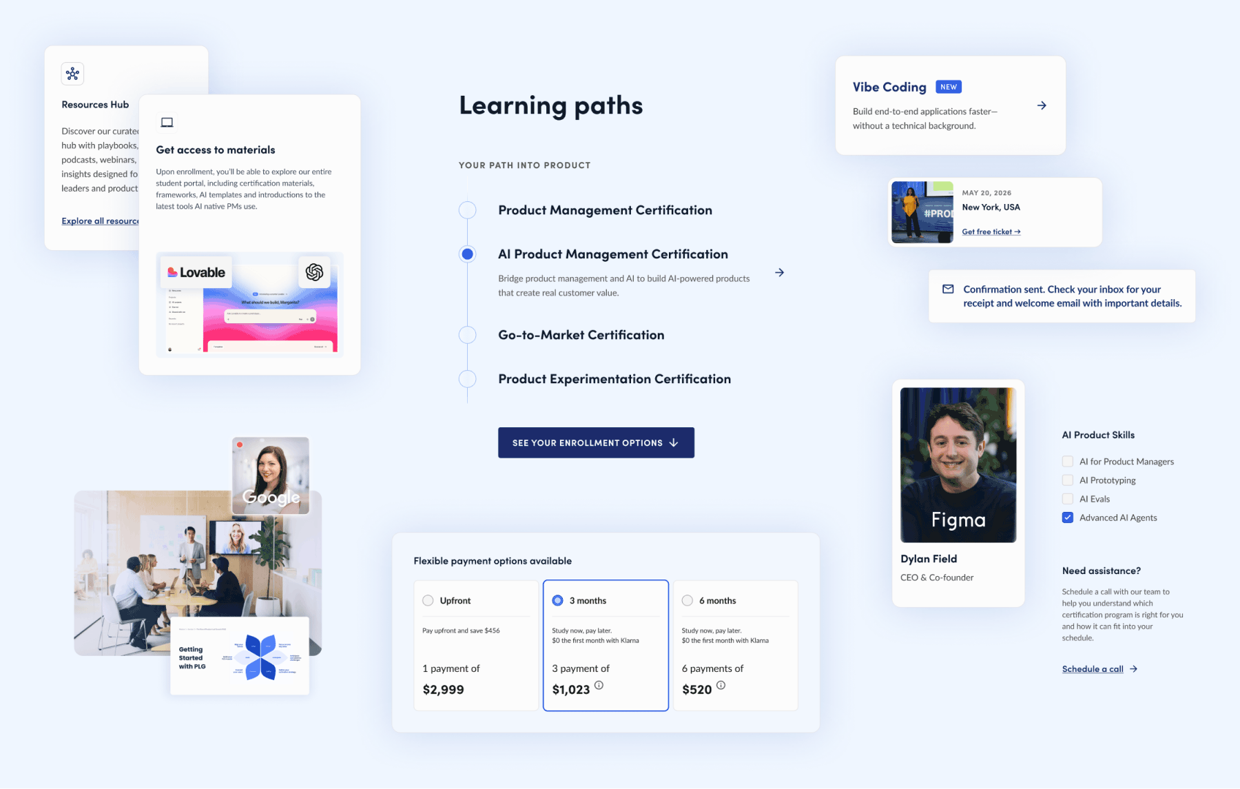
35 components / 4,555 pages
Every page on the site built from the same set of blocks.
2–3 days → hours
Time to build a new landing page, once content-first workflow replaced design-from-scratch.
1 system, 4 disciplines
Designers, engineers, content editors, and PMs — all from the same source of truth.
The work we did in years one and two didn't feel like AI infrastructure at the time. We were just trying to stay consistent at scale. But it turned out to be exactly that. Good foundations don't expire. They compound.
Design systems in 2026 aren't about components. They're about context. Components are free. Taste is priceless. And taste is what you encode, slowly, over years, in every naming decision and usage note you write.